👋🏼
Hi, Welcome to Curu
New User ConversionStarting in June 2023, we made new partnerships and gained a massive influx of new users. The product team saw an opportunity to refine the new user experience and ensure we served their needs.
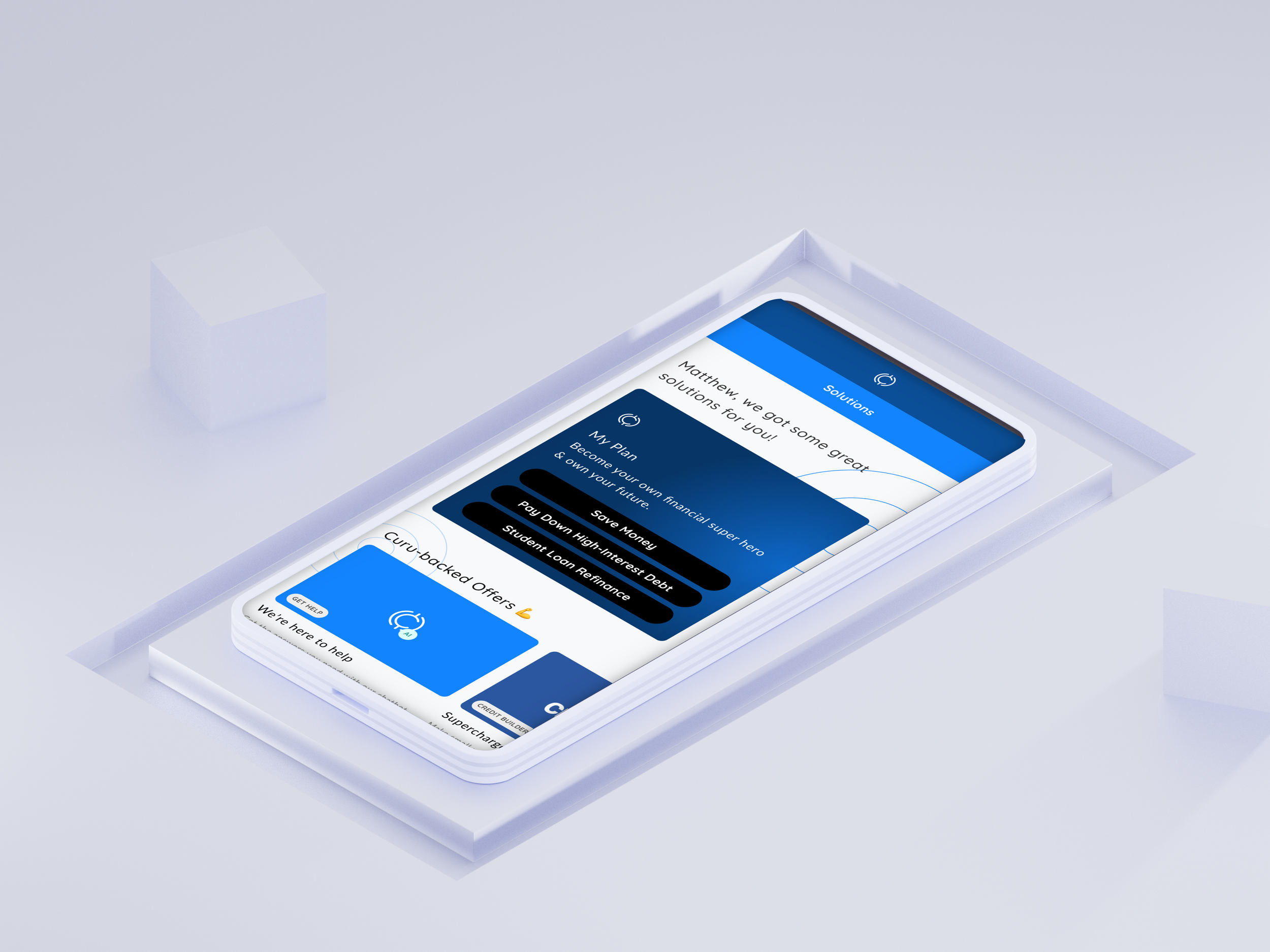
Curu is a for-profit financial products marketplace that started out as a Credit monitoring solution in 2017. Since then, their services have expanded to include a bill negotiation tool, AI personal assistant, and more.
Preface
Where it began
It all started with an initial pass when I first started at Curu around January of 2023. There were multiple areas where we could make massive improvements with relatively low engineering lift - I focused on Onboarding. It was difficult and broken - selecting your birthdate was nearly impossible unless you were born yesterday, buttons blended in with the background, & copy was misleading leaving many people wondering “Why am I here?”.
How we progressed
We knew we couldn’t move mountains in a day, so we started small and slowly ramped up the projects and the scale of projects as we saw improvements. Baseline we started with approximately 31% conversion of people signing up for financial products and 33% of those people opting for the “boost my credit” solution, the most popular solution offered - our sign-up CTA. Needless to say, most people did not enjoy that experience.
This epic started with fixing that problem - “boost my credit”. That was the start and we had no idea where this would take us. Five related projects, three user research initiatives, countless iterations, feedback loops, and 8 months later we have arrived to where we are today - 68% new user conversion and a whole lot of possibilities.
Where are we now?
It’s now September 2023. The overall conversion of our new users regularly sits above 70% - about a 8% increase from our last experiment. Considering we started at 30% conversion, we are doing great! Things seem to be trending in the right direction, but we can always do more.
This is the story of the last phase.
New User Conversion
Lead Product Designer
June - July 2023
Information Architechture, UX, Visual Design, & Research

The Project
With new users joining Curu, we wanted to examine how people explored the site and learn what would be the preferred way for our users to explore our financial products. This included multiple phases of research, ideation, and visual design.
The Opportunity
Engagement for our personalization features was low. We attempted to make adjustments to personalization with no success and more questions arose from our users about how we suggest products. This was our opportunity to learn about user habits.
The Solution
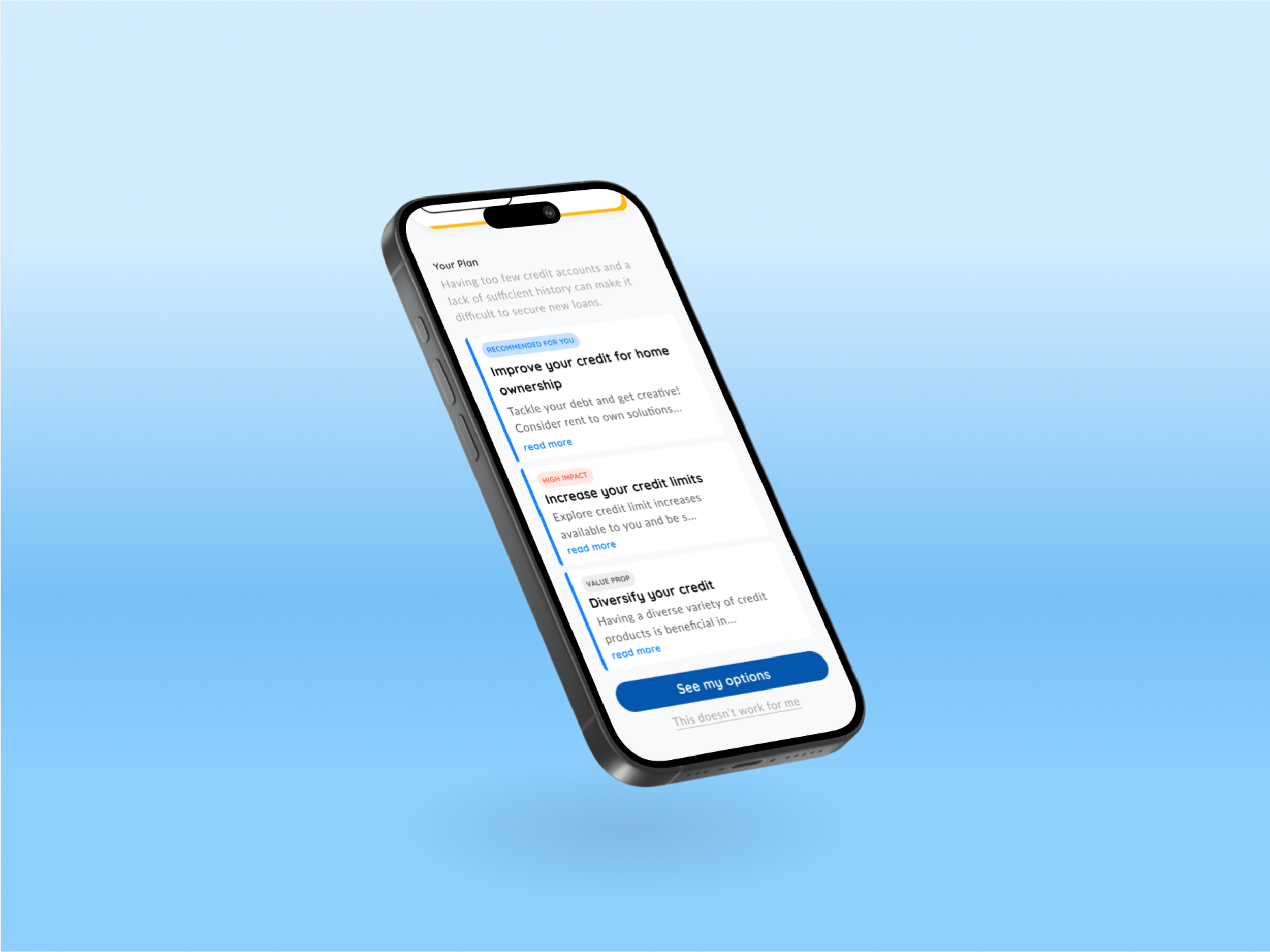
We named this project “Solution Finding”. We wanted to explore how our users find the perfect solution to their problems and felt this project name was appropriate. The design I recommended included an overhauled menu for existing users to interact with and a reexamined user journey on mobile to reflect our findings. The new journey focuses on step-by-step navigation paired with menu items that provide an image and supporting copy, encouraging our users to explore and find their perfect solution. Results are still pending.
Research
Gather requirements, examine competitors, conduct user research, share out my findings.

“Empathy grows as we learn”
The project initially kicked off with strong metrics on the new user conversion side of things - 68% of users selecting and applying for products. On the flip side, our returning users were exploring solutions 20% of the time and about 8% converting.
Personalization and the existing structure of solution exploration for existing users were not working. We learned this from existing feedback and low metrics from our returning users.
We started with an open card sort, due to the nature of the project targeting navigation. 10 users participated in the card sort, with 9 of 10 users feeling very confident about their decisions and an average comprehension of the cards scoring an 8 of 10. We learned our existing navigation structure was very different compared to our results - we were onto something.
Wireframing
Ideate, empthize, wireframe, test, lofi prototypes, & more testing.
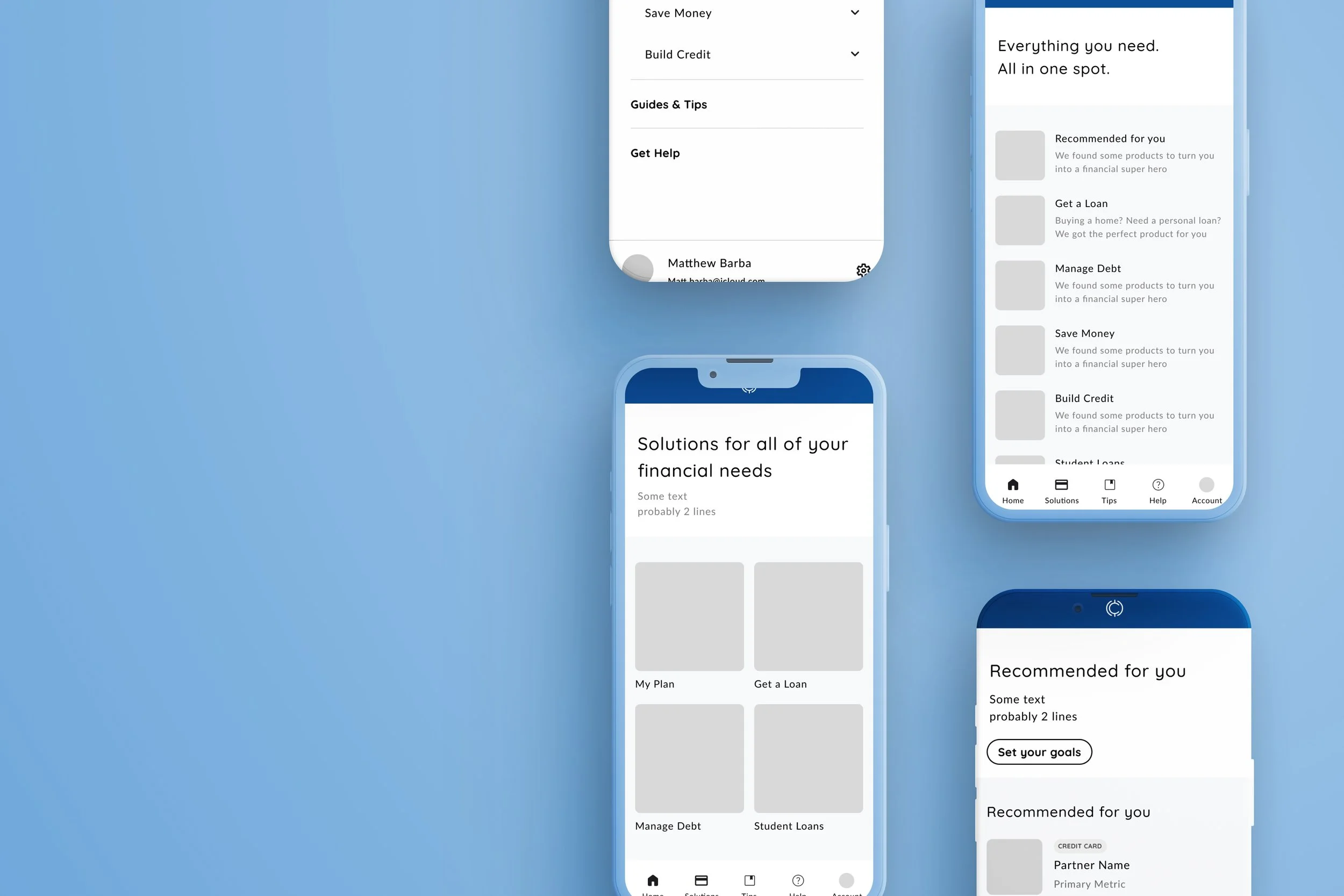
We had the information we needed to recreate our navigation, now we had to find out what the experience should look like. Going into ideation I wanted to test concepts with our users to see what felt the most natural.
So to Figma I went. I swear I am on Figma more than I am in my own bed, but besides that fact, the way I approach wireframing and ideation is methodical. I thought about the different ways people navigate, familiarized myself with these “modes of transportation”, and then created extreme versions of these concepts in the form of wireframes to ensure there was little overlap with our results. I also took some time to create a user journey map, a light competitive analysis, and collected a little more information about our users. Did you know that 80% of all millennials have student debt? Ouch.
Once we nailed the concepts we wanted to test, that is exactly what we did -test. We recruited 10 users, asked them to navigate through the prototypes of our wireframes using the Figma prototype, and found that users liked the visuals the most, but preferred the concept that paired visuals with context (top right).
User experience & Visual Design
Nail the UX and bring it up to brand standards. Or down depending on how wild we got.
So the question now moved to “how can we optimize this new experience? “. How can we make sure our users are receiving the right products to move them forward on their financial journey - this is where our partners came in. 90% of our users came from referrals! We knew where our users came from, and what they were trying to accomplish before arriving at Curu - it kind of felt like a cheat code.
We knew 1) how people organized our products, 2) how they like to explore, and 3) what their motivations are. We are in a good spot, but I wanted to provide our users with the best experience as possible - I accomplished this by recommending smart solutions to our dev team. Basically, the landing page would be tailored according to where our users came from, offering the most relevant solution to each user coming to Curu, with an option to explore other solutions if we missed the mark. For users that discovered Curu naturally, they were offered the most popular solutions with the same “eject button” to show all categories of products.
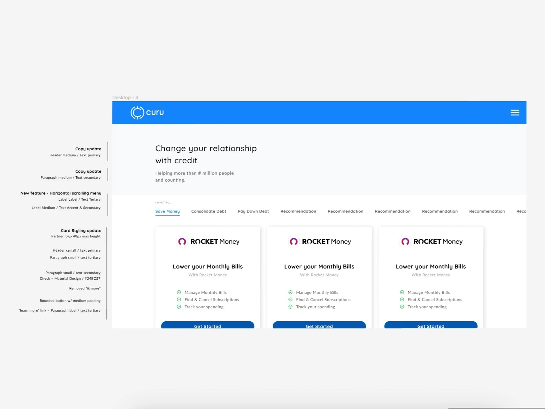
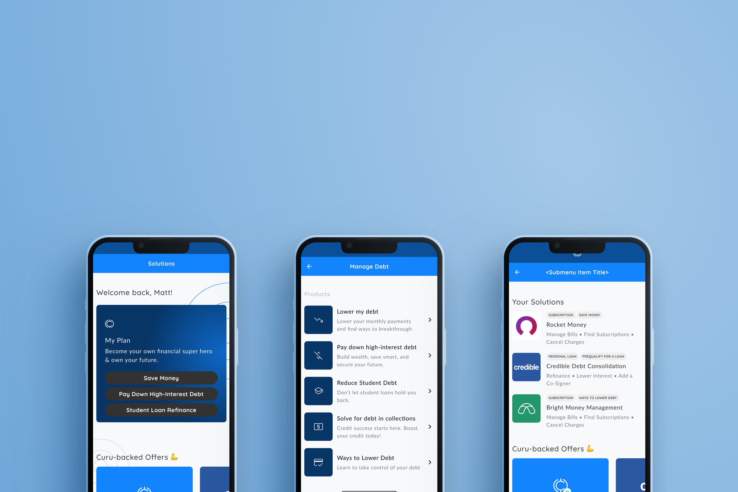
The user experience felt good, and the last step was visual design. Luckily, I created a design system a couple months back, so this step was pretty quick. We ended up with a redesigned mobile experience that included 3 new screens, all pretty lightweight, a slightly altered personalization feature on the landing page, and a new dropdown menu for our desktop users.
Retro
Not like what’s “in”.

This feature is currently being tested on the site & we don’t have any definitive numbers on it quite yet.
This was a large undertaking in the grand scheme of things. I was hired to bring a data-based design culture to Curu and I believe I was finally given the opportunity to do so.
I think the most important learning to come out of this project is something that came up along the way, and that is centered around choosing the “right solution”. That comes down to how you define what is the right solution. Is it the financial product that will increase your credit score the most? Maybe its the one that offers you the lowest monthly payment. I thought what if the right solution was a blend of some of these questions, in addition to your financial factors, such as your credit score?
Nothing feels worse than being rejected, being referred to someone that will “help you”, to then be rejected, again.

