Feature Design at KivaDesign for good.
My manager once told me. I heard his words, but I didn’t hear them. We have the opportunity to impact the lives of millions of people around the world & I’m so glad I could be a part of that team of amazing people making a difference.

Kiva is a global non-profit that connects everyday people with entrepreneurs and small businesses in need of capital. By pioneering the model of impact investing, Kiva has unlocked over $2B in loans, empowering millions of individuals to pursue education, grow women-led businesses, and build brighter futures.
Helping more at checkout
Role || Jr. UX Designer
Timeframe || 05.2022 - 06.2022
Challenge
The ability to lend is what makes Kiva unique, but that creates its own set of challenges. Our lenders were not depositing new dollars and the product team saw an opportunity in the checkout experience. While the experience was fundamentally good, I was able to identify some areas of opportunity and successfully design a feature that exceeded all of our expectations. It’s currently live - add any loan to your basket to see it!

Approach
As the lead UX/UI Designer for this project, we knew we were taking this project from concept to delivered. First was understanding the problem with a strong research initiative, giving us more insight into our users than ever before.
We knew that if this project were to be successful, we had to address two major pain points:
Users want to “maximize their impact” but they don’t always know how to do this.
Deciding who to lend to is difficult & requires a lot of decision-making, emotional endurance, and critical thinking skills.
We were keeping our eyes on a few KPIs: average checkout dollars, conversion rate, and overall nps. Our users did not like the feeling of being “sold” on something.
From a user’s perspective, the experience had to provide meaningful value - it had to be meaningful.
Impact
My recommendation was a checkout upsell. It is a modal that lives on the checkout page. It relies on our loan recommender API to deliver personalized results. On top of this, the recommendations are sorted by the lowest amount left until the loan was complete. The UX of the feature was relatively simple, providing users with a picture, a name, and the amount left on the loan. The visual design had to be unique so there was no mistake that this was an “add-on”.
Alongside that, I was able to work with stakeholders, the product team, & engineers to push forward the $5 notes project - allowing our users to lend their funds in $5 increments as opposed to $25 increments.
The combination of these two features had cascading effects across the entire platform. Not only did we make lending more accessible by lowering the bar to entry, but my feature also helped “stranded” borrowers - those who had less than $25 to complete their loan.
In about 3 weeks, I was able to take this project from idea to delivered, and about two weeks later my project went live. We increased basket value by almost 20%, and we never looked back.
Retrospective
This feature is more than just a checkout upsell. It helps Kiva continue with its mission, but more importantly, it helps borrowers finish their funding goals.
This was my first win at Kiva! I managed to reach most KPIs, with a 33% conversion rate and an increase of average checkout amount by 17%.
I didn’t take the time to consider the implications of the feature I designed. I was caught up in learning, experiencing, and creating more. It’s a small feature and I barely knew what I was doing, but I wish I could go back in time and make it “crispy”.
Regardless, I’m glad it has helped thousands of borrowers in the short time it has existed. That’s a beautiful thing.
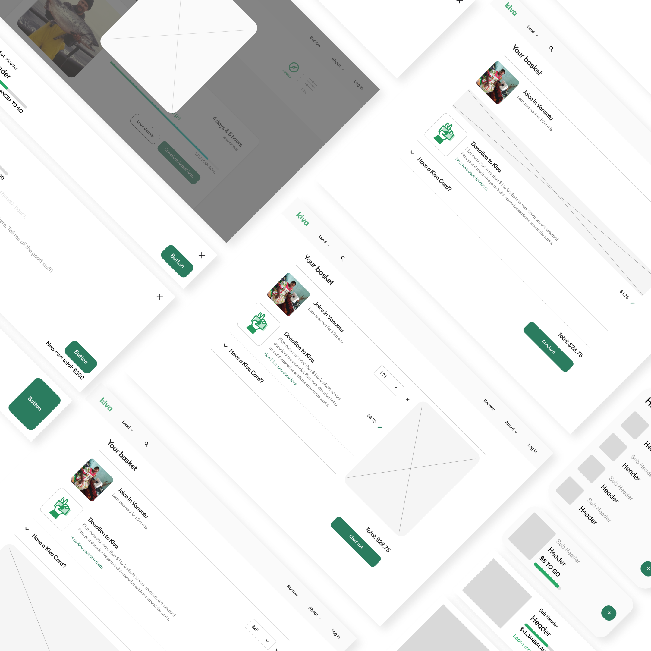
Initial ideation & explorations of the test-
User gets an email notification that they have been repaid for their previous loan. It has been about 3 months since the last time they visited Kiva & they are excited to help someone new.
What a time to be alive, am I right?! -
User typically lands at their account page from the email notification. From there they check their previous loan, how the borrower is doing, and lastly, they make sure they have enough to lend again (minimum amount is $25).
-
Here is the fun part for our users, finding the perfect person to support. While this is fun for many of our users, it is difficult. Many people ask “how can I choose between these people?”. A single mom running a shop in the Philippines, or a farmer in Uganda trying their best to support their family - it’s a gut-wrenching decision at times.
Users will go to a specific category and then apply their own filters (in their minds), making the decision to give to a specific gender, location, or business type.
They will then scroll through a page or two of borrowers, adding the ones they like to their cart. Then they will switch categories, or once they feel satisfied, they will move onto the decision.
-
The decision to give to one person or another is not one that is taken lightly. Our users will typically look for specific details within a borrower’s profile to narrow down their choices as to who they really want to lend their money to since most of our fun lovers only have the funds to give to one person. This process varies from user to user, some taking a couple of minutes, while others may take up to 30 minutes to decide - if they are able to make a decision at this time.
Remember, this is a game and they have to find the most impactful person to lend to!
-
Users go on to review their cart once the decision has been made. At this point, many users feel emotional exhaustion. While there has only been 1 decision made, there is a lot to the filtering process many of our users experience.
At this point, users have a couple of last things to wrap up. They can adjust their loan amount(s), decide to donate to Kiva, input a gift card, and remove any borrowers they decided they are not supporting at this time.
The new feature I designed ended up here! -
Payment is built into the checkout page as a single experience. Users can choose between a credit card & using their PayPal account for easy checkout!
-
Follow-ups would typically be more engaging if the borrower was from the US, allowing our users to receive notifications from the borrower, primarily because they spoke English. If the borrower was a non-US borrower, updates would only come if 1) the borrower was delinquent, 2) you will be receiving a payment soon, or 3) the loan was fully repaid.
-
This should probably live in the “follow-up” section, but I believe that primary actions should be the star of their own show!
The user just got an email. It’s time to lend again :)
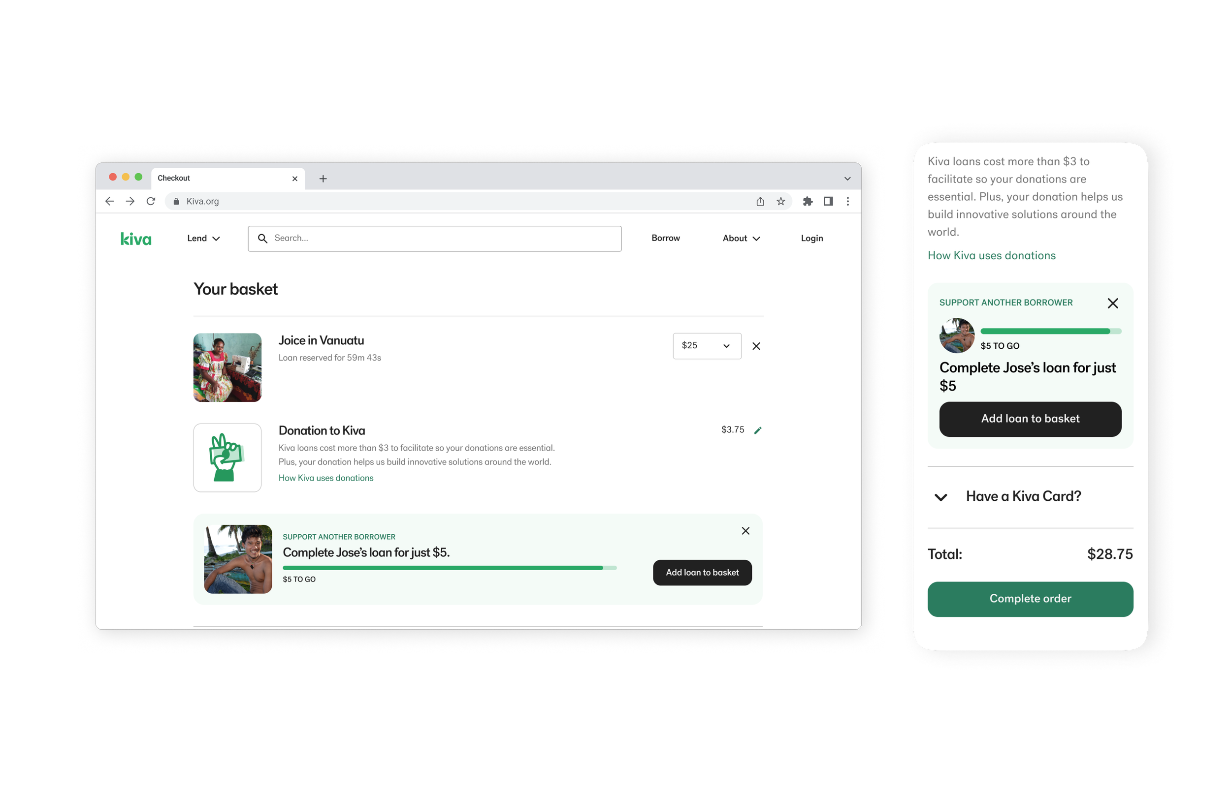
User journeyProduction version of my feature that is currently live.